
Projectes Artístics
Persones abans que gèneres

Per aquest projecte vaig utilitzar una pilota de futbol, ja que fa anys el futbol es veia més com un esport per a homes, i a cadascun dels hexàgons hi he dibuixat coses que representen els estereotips que els homes i les dones han de complir, per tal de trencar amb això i mostrar que no tothom ha de ser igual.
For this project, I used a soccer ball, since years ago football was seen more as a sport for men. On each of the hexagons, I drew things that represent the stereotypes that men and women are expected to follow, in order to break with these ideas and show that not everyone has to be the same.

Les paraules també deixen marca
En aquest projecte vam tractar el tema de com afecten els comentaris i estereotips a les dones. Vam agafar aquest maniquí i vam posar-hi cintes mètriques per fer referència a l'estereotip on diu que la dona ha d'estar prima. Darrere el maniquí hi ha un paper de color groc amb la frase "Les paraules també deixen marca" amb fletxes assenyalant al maniquí per donar més impacte.
In this project we dealt with the topic of how comments and stereotypes affect women. We took this mannequin and put measuring tapes on it to refer to the stereotype that says a woman has to be thin. Behind the mannequin there is a yellow sheet of paper with the phrase "Words also leave a mark" with arrows pointing at the mannequin to give more impact.
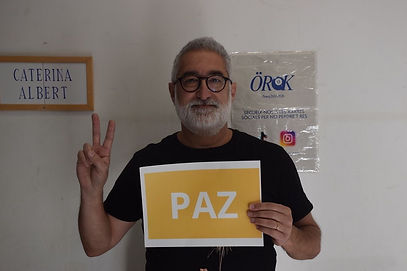

Pau i justícia
Pel nostre projecte final hem escollit dues tècniques diferents, un Videoart, un Videoart/projecció i una instal·lació.El nostre projecte es basa en crear un vídeo, on els alumnes de l'escola representin el signe de la pau, sostinguin cartells amb la paraula pau escrita en diferents idiomes i per últim, una frase relacionada amb la justícia i la pau. Frase escollida: La pau i la justícia neixen quan ens escoltem, dialoguem i ens tractem amb respecte.Amb aquest treball, volem donar veu a les injustícies socials d'avui en dia. I amb ell, aconseguir una societat en pau i justa, sense discriminacions ni racisme.
For our final project, we have chosen two different techniques: Video Art, Video Art/projection, and an installation. Our project is based on creating a video in which the students from the school represent the peace sign, hold posters with the word “peace” written in different languages, and finally, a sentence related to justice and peace.
Chosen sentence: Peace and justice are born when we listen to each other, engage in dialogue, and treat one another with respect.
With this project, we want to give voice to today’s social injustices and, through it, work toward achieving a peaceful and fair society, free from discrimination and racism.


MNAC
He triat aquesta obra perquè m’ha semblat molt impactant i fàcil d’entendre només mirant-la. Encara que és antiga, transmet molt bé la idea de la guerra i de defensar una causa. Això m’ha ajudat a inspirar-me per representar un conflicte actual, perquè he vist que l’art pot expressar sentiments forts sense necessitat de dibuixar escenes molt dures.
M’he inspirat en l’obra original fent servir un símbol per representar la guerra en lloc de dibuixar una escena real. També he intentat que el meu dibuix sigui clar, directe i que transmeti un missatge fort, com el cartell original.
El missatge que vull transmetre és que la guerra entre Israel i Palestina és un conflicte on els dos bàndols es culpen mútuament i això fa que la violència continuï. Vull mostrar que mentre cada costat assenyali l’altre com a culpable, serà molt difícil trobar una solució. També vull transmetre que darrere d’aquest conflicte hi ha molta tensió, por i sofriment. Amb el meu quadre vull fer reflexionar que la guerra no soluciona res i que el que realment faria falta és deixar d’assenyalar i començar a buscar la pau.
El meu quadre mostra dues mans al centre de la imatge que s’estan assenyalant amb el dit. Cada mà porta una màniga amb una bandera: una és la d’Israel i l’altra la de Palestina, així es veu clarament que representen els dos bàndols del conflicte. Darrere de cada mà hi ha varies armes, col·locades en horitzontal. La composició és bastant simètrica, ja que les dues parts són molt semblants.
I chose this artwork because I found it very striking and easy to understand just by looking at it. Even though it is old, it clearly conveys the idea of war and defending a cause. It helped inspire me to represent a current conflict, because I realized that art can express strong feelings without needing to depict very harsh or violent scenes.
I was inspired by the original artwork by using a symbol to represent war instead of drawing a realistic scene. I also tried to make my drawing clear, direct, and capable of conveying a strong message, like the original poster.
The message I want to convey is that the war between Israel and Palestine is a conflict in which both sides blame each other, and this keeps the violence going. I want to show that as long as each side continues to point at the other as guilty, it will be very difficult to find a solution. I also want to express that behind this conflict there is a lot of tension, fear, and suffering. With my painting, I want to encourage reflection on the idea that war solves nothing, and that what is truly needed is to stop blaming each other and start seeking peace.
My painting shows two hands in the center of the image pointing at each other with their fingers. Each hand has a sleeve with a flag: one is Israel’s and the other is Palestine’s, making it clear that they represent the two sides of the conflict. Behind each hand there are several weapons placed horizontally. The composition is quite symmetrical, since both sides are very similar.

Projecte personal, conflictes interns, escultura
Per al meu projecte he creat una obra de string art sobre una base de fusta pintada de blanc. Després de preparar la superfície i col·locar 288 claus de manera precisa, vaig utilitzar fils per formar la imatge d’un llop a partir d’un patró generat amb l’aplicació String Art Maker. La idea neix d’un treball previ sobre les amistats i la soledat, i vaig escollir el llop perquè simbolitza la figura del “llop solitari”. Amb la composició centrada i el fons blanc he volgut transmetre una sensació d’aïllament i buit, tot i que l’obra permet diferents interpretacions segons la mirada de cada espectador.
For my project, I created a string art piece on a white-painted wooden base. After preparing the surface and carefully placing 288 nails, I used threads to form the image of a wolf based on a pattern generated with the String Art Maker application. The idea originated from a previous project about friendship and loneliness, and I chose the wolf because it is often associated with the concept of the “lone wolf.” Through the centered composition and the white background, I wanted to convey a feeling of isolation and emptiness, while still allowing viewers to interpret the artwork in their own way.
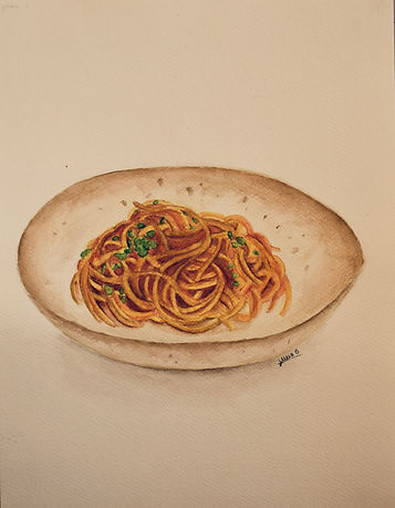
Il·lustracions llibre recepta cuina
Per a aquest projecte vaig haver de realitzar una il·lustració per a un llibre de receptes de cuina, amb la condició que fos d'un primer plat. Vaig decidir fer uns espaguetis a la bolonyesa, ja que em semblaven una opció visualment atractiva i amb molts detalls per treballar. Per elaborar la il·lustració vaig utilitzar la tècnica de l’aquarel·la, que em va permetre donar color, profunditat i realisme als ingredients. L’objectiu era crear una imatge atractiva que transmetés l’aspecte i la textura del plat de manera clara.
For this project, I had to create an illustration for a cookbook, with the requirement that it represented a main course. I decided to illustrate spaghetti Bolognese because I found it to be a visually appealing dish with many details to work on. I used watercolor techniques to create the illustration, which allowed me to add color, depth, and realism to the ingredients. The aim was to create an attractive image that clearly conveyed the appearance and texture of the dish.

Il·lustració Alícia al País de les Meravelles
Per a aquest projecte vaig haver de realitzar una il·lustració inspirada en Alícia al País de les Meravelles. Per trobar una referència, vaig buscar diferents imatges a Pinterest i vaig escollir una il·lustració que em va agradar especialment, la qual vaig representar amb el meu propi treball. Per donar color i detall al dibuix, vaig utilitzar llapis de colors per als elements principals i els detalls més precisos, mentre que per al fons vaig fer servir colors pastel. Aquesta combinació de tècniques em va permetre crear una imatge amb contrast, profunditat i una atmosfera més suau i imaginativa.
For this project, I had to create an illustration inspired by Alice's Adventures in Wonderland. To find a reference, I searched for different images on Pinterest and chose an illustration that I particularly liked, which I then recreated in my own work. I used colored pencils for the main elements and fine details, while pastel colors were used for the background. This combination of techniques allowed me to create an image with contrast, depth, and a soft, imaginative atmosphere.